Geopandas
Imports for jupyter
import numpy as np
import pandas as pd
import matplotlib.pyplot as plt

import geopandas as gpd
from shapely.geometry import Polygon, Point

%config InlineBackend.figure_format = 'retina'
%matplotlib inline
%load_ext autoreload
%autoreload 2
Install Geopandas using Conda (2022)
conda install -c conda-forge fiona python=3.9 fiona shapely rasterio pyproj pandas geopandas
Geopandas load shape file
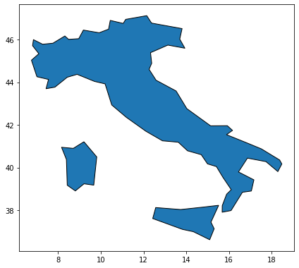
We can load maps from the geopandas default database ['naturalearth_cities', 'naturalearth_lowres', 'nybb']
world = gpd.read_file(gpd.datasets.get_path('naturalearth_lowres'))
ax = world[world.name=='Italy'].plot(edgecolor='black', linewidth=1)
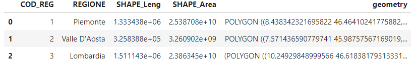
For higher resulution images a specific shape file is needed. The italian one can be found here.To import the geopandas dataframe one need fout different files in the same folder: .dbf, .prj, .shx and .shp. Then, we can load a region dataset as follow:
df_regions = gpd.read_file(
    filename='../data/Reg2016_ED50/Reg2016_ED50.shp').to_crs({'init': 'epsg:4326'})

# Or by merging different provinces:
# df_prov = gpd.read_file(
#    filename='../data/prov_geo/CMProv2016_ED50_g.shp').to_crs({'init': 'epsg:4326'})
# df_regions = df_prov[['COD_REG', 'SHAPE_Area', 'geometry']].dissolve(
#                                                 by='COD_REG', aggfunc='sum')

ax = df_regions.plot(edgecolor='white', linewidth=1, figsize=(7,7))
ax.figure.savefig('../plots/italy_reg.png', bbox_inches='tight')

df_regions.head(3)
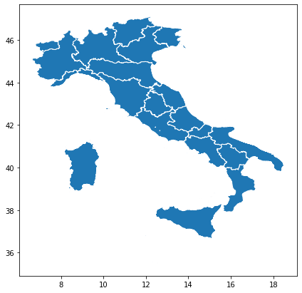
Merging information from pandas dataframe
one can merge information from a different dataframe. Here we will use the map of the italian antennas downloaded from here. It contains the coordinates of lots of antennas in the italian territory.
df_antennas = pd.read_csv('../data/antenne.csv', sep=';', encoding = "ISO-8859-1")
antennas_position = gpd.GeoSeries([Point(x, y) for x, y in zip(
    df_antennas.Longitudine, df_antennas.Latitudine)])

ax = df_regions.plot(figsize=(7, 7), color='None', edgecolor='black',
                     zorder=6, linewidth=0.6)

antennas_position.plot(markersize=0.5, ax=ax, color='red', zorder=4)
ax.set_axis_off();
ax.figure.savefig('../plots/italy_antennas.png', bbox_inches='tight')
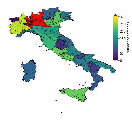
We can count the number of antennas contained in each of the italian region:
# this might take a while
df_regions['num_antennas'] = df_regions.geometry.apply(
    lambda g: np.sum(([antenna.within(g) for antenna in antennas_position])))


fig, ax = plt.subplots(1, figsize=(7,7))

vmin, vmax = 0, 300
cmap = plt.cm.viridis
cmap.set_over('red')

df_regions.plot(column='num_antennas', vmin=vmin, vmax=vmax, ax=ax,
                edgecolor='black', linewidth=0.5)
antennas_position.plot(markersize=0.2, ax=ax, color='black', zorder=4)

ax.set_axis_off()
cax = fig.add_axes([0.85, 0.5, 0.03, 0.3])
sm = plt.cm.ScalarMappable(cmap=cmap, norm=plt.Normalize(vmin=vmin, vmax=vmax))
sm._A = []
cb = fig.colorbar(sm, cax=cax, extend='max')
cb.set_label('Number of antennas')

fig.savefig('../plots/antennas_per_region.png', bbox_inches='tight')
The same effect can be achieved by joining the two dataframes using a common column. In this case we can exploit the column: Comune:
df_antennas = pd.read_csv('../data/antenne.csv', sep=';',  encoding = "ISO-8859-1")
df_regions = gpd.read_file(
    filename='../data/Reg2016_ED50/Reg2016_ED50.shp').to_crs({'init': 'epsg:4326'})

df_antennas.replace({'Regione':
                   {
                       "Valle d'Aosta":"Valle D'Aosta",
                       'Friuli-Venezia Giulia': 'Friuli Venezia Giulia'

                   }}, inplace=True)

df_regions = df_regions.set_index('REGIONE')
# df_antennas.set_index('Regione')

# df_antennas
df_antennas['REGIONE'] = df_antennas.Regione

df_conbined = df_regions.join(df_antennas.groupby('REGIONE').count())